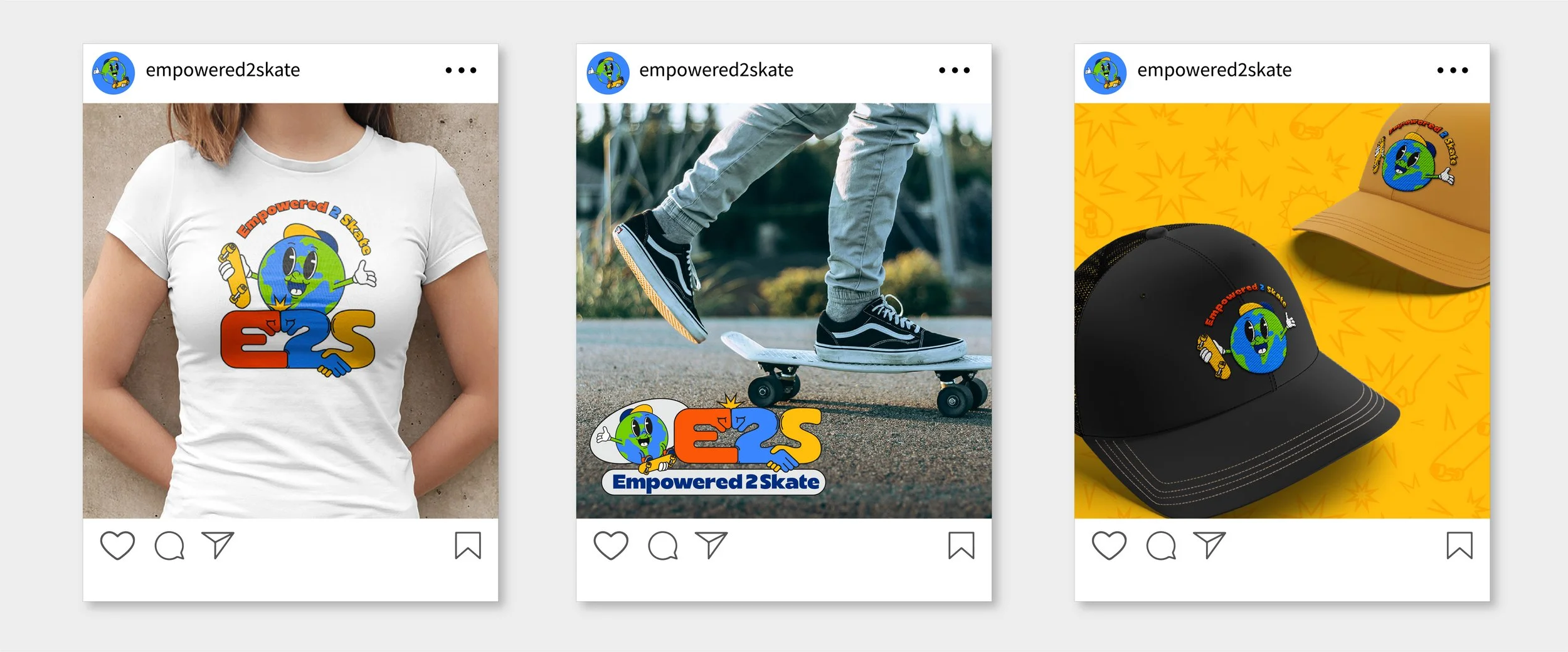
E2S is a skateboarding company that aims to enhance the health and wellbeing of children and adults. They specialise in coaching neurodivergent individuals and disadvantaged communities by delivering a specialised skateboarding programme.The client was looking for a brand identity that is both cool and fun, whilst also representing a community of disadvantaged skaters.Empowered 2 Skate
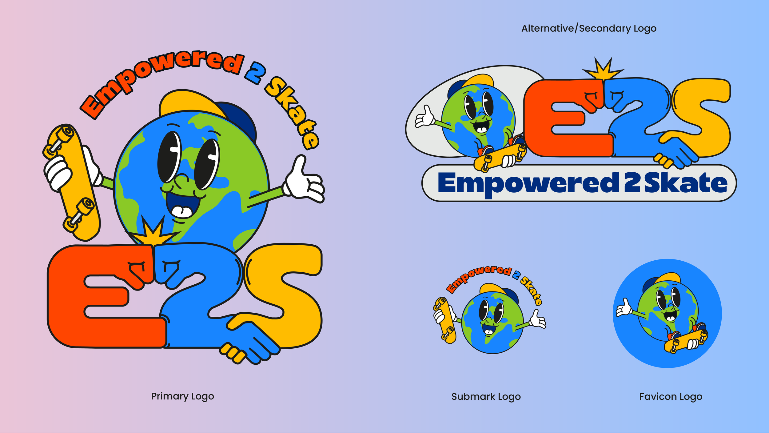
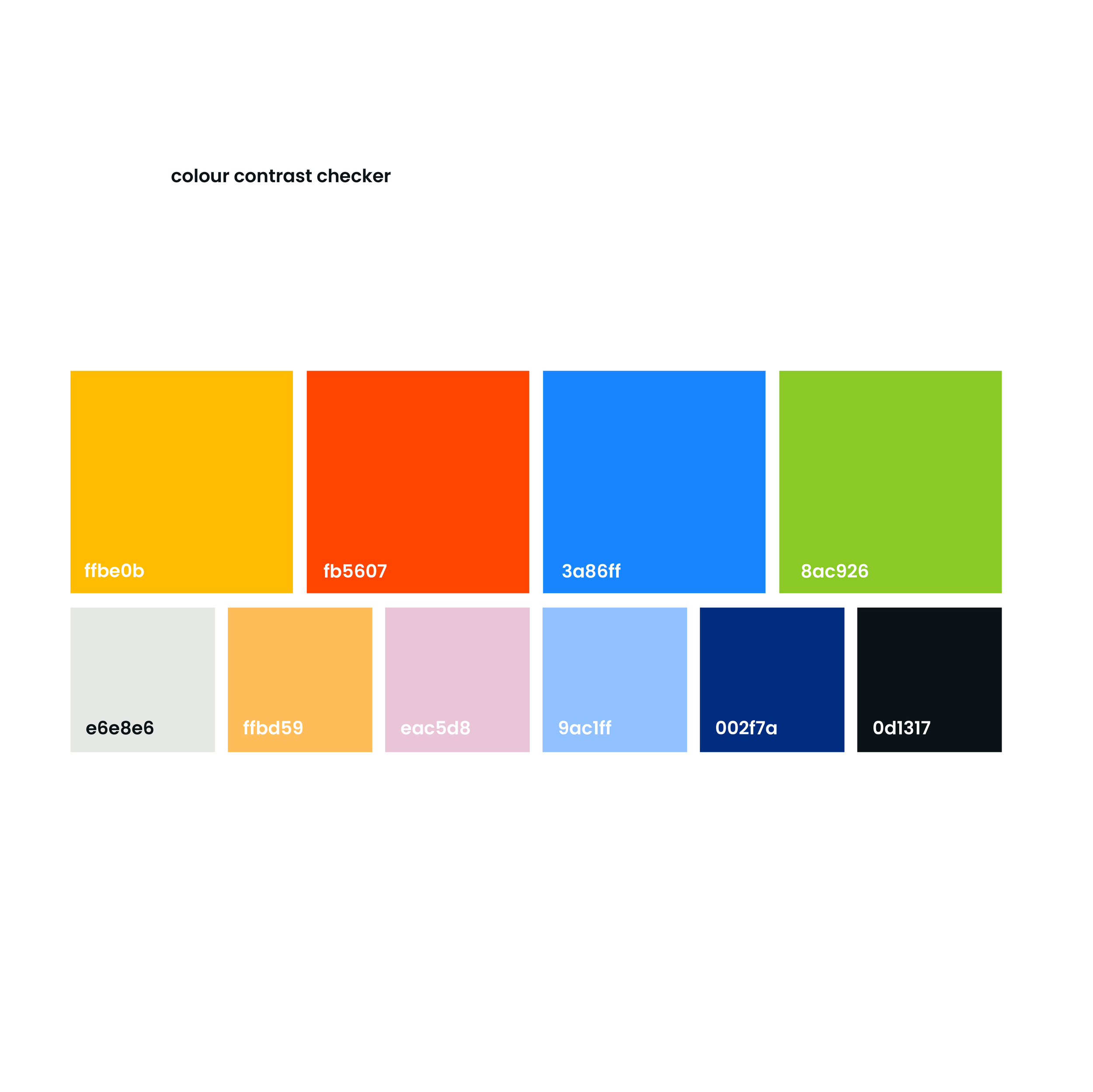
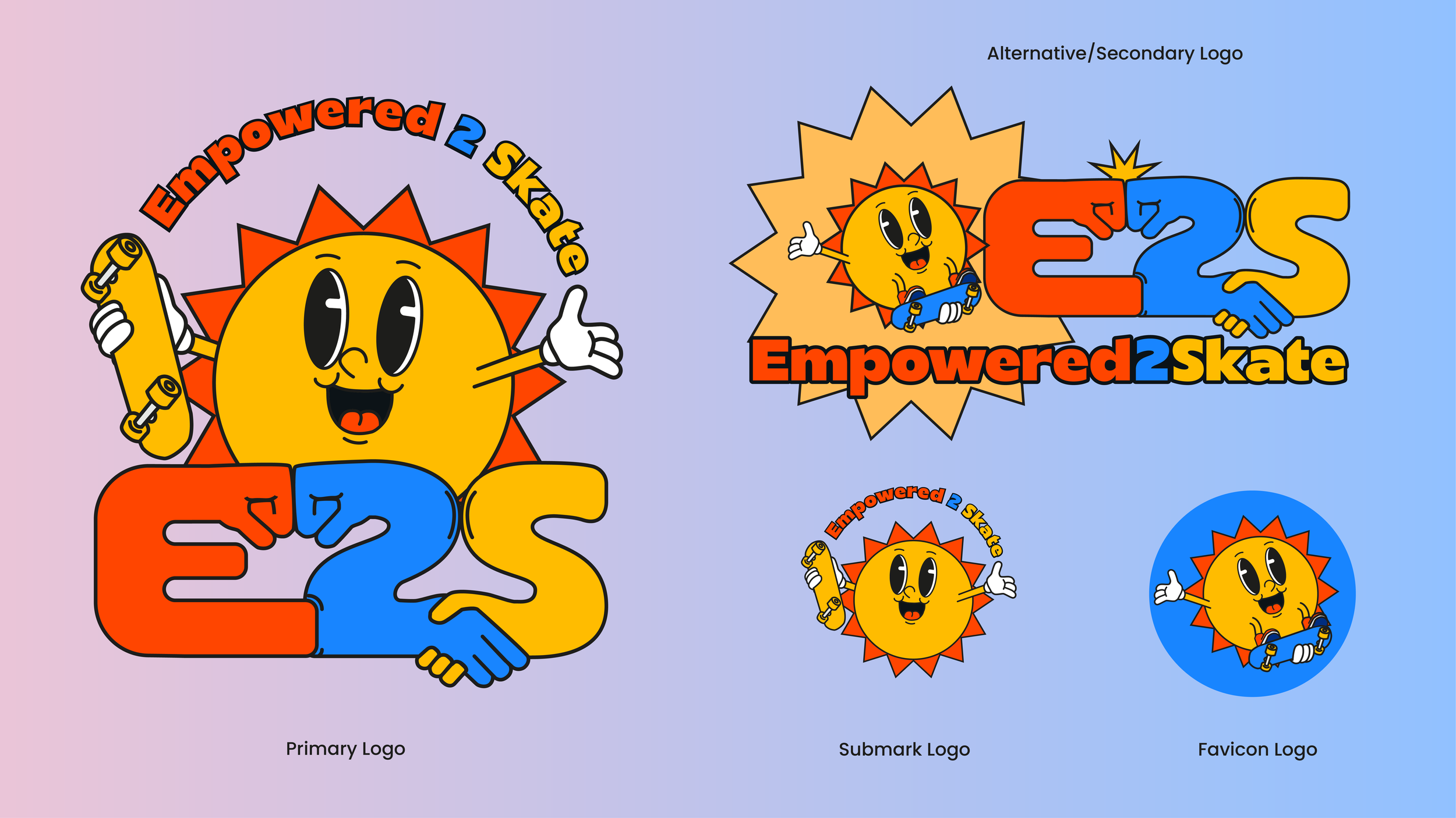
The fist-bump and handshake within the typography represent the community's inclusivity and the encouraging nature of skateboarding.Moreover, the client requested a “character of an earth wearing a cap on a skateboard”. I also created an alternative sun character as a second option. These cartoons are very typical of skateboard branding.The colour palette reflects playfulness. I included neutrals and darks to make it more versatile and tested the palette [using the colour contrast test] to be compliant and accessible for people with disabilities.